Logos
The Able Zine logo grew out of much experimentation and for those interested in it’s evolution, I’ll describe it here. Like lots of features in Issue 1, it was designed by hand and later digitised. I knew I wanted the logo to be somewhat child-like and playful, maybe even having a star or a smiley face and I wanted to reference or symbolise disability inside the logo. So, at any given time, the ‘L’ was an upside-down walking stick, the ‘b’ was a wheelchair, and the ‘e’ was an eye similar to vision impairment symbols. I used shoelaces and tape to create the word in 3D. There was a rawness I was trying to capture that resembled someone’s first experience of mark-making. I am equally inspired by neurodivergent artists, such as those promoted by the likes of Hart Club, or by charities such as Headway, an East London charity for brain injury survivors.
Later I worked with a graphic designer, Conor, and we began to explore digital designs that were more simplistic and eventually settled on digitised brushstrokes I’d done in ink, but something was lacking. I realised the ‘L’ sat at this jaunty position and if you added a simple curve underneath it, it looked like a wheel beneath a seat/wheelchair. In our logo the stylisation isn’t reductive how the symbol sometimes is. It’s abstract enough that it reminds you of a smile or a wink and it makes me happy to look at. Able is about challenging stereotypes and I think this is captured by the logo quite nicely.
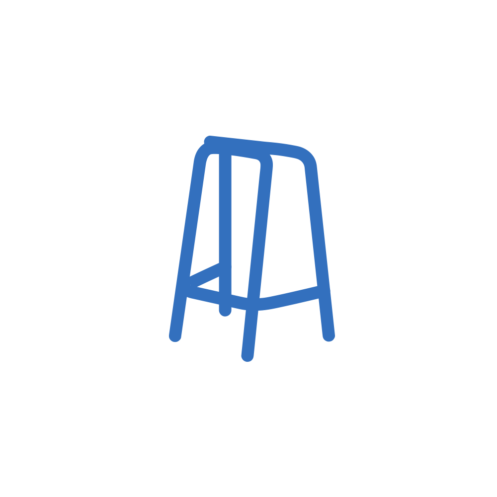
We played around with some simpler ‘icons’ that could represent the mag, and took inspiration from pill capsules and things like this. In the end I fell for a simple stylisation of a traditional walking frame, the shape being a series of ‘A’s.


